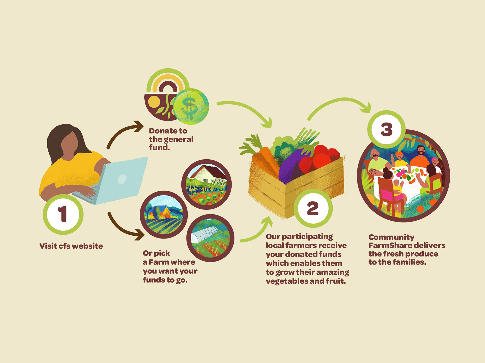
"How does it work?" • Explainer Diagram Design and Illustrations
Community FarmShare links families experiencing food insecurity in their community to local produce farms. They needed an explainer illustration to use on their website, flyer and newsletter. to explain the process of donating, contacting and food distribution to the families.
Below are the first sketches/studies we explored for the diagram.
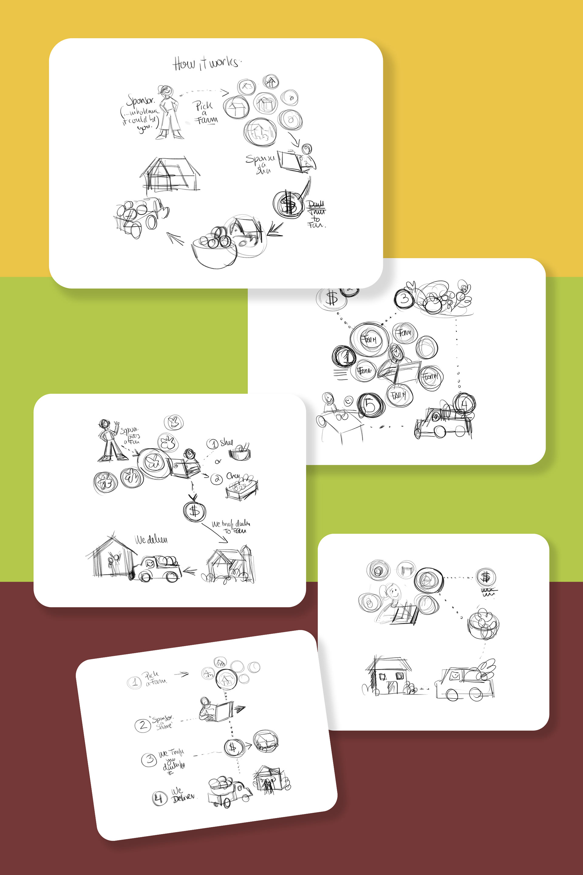
The sketch above with the linear layout was the one we felt was the more successful one to explain the process.
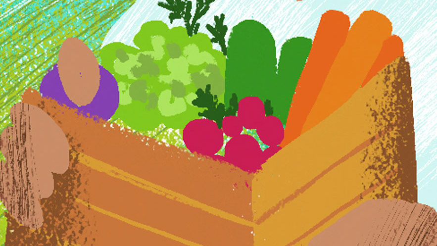
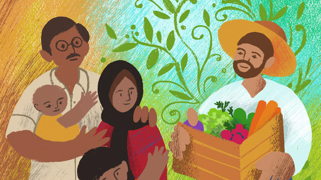
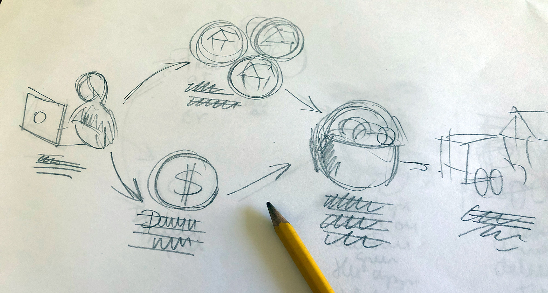
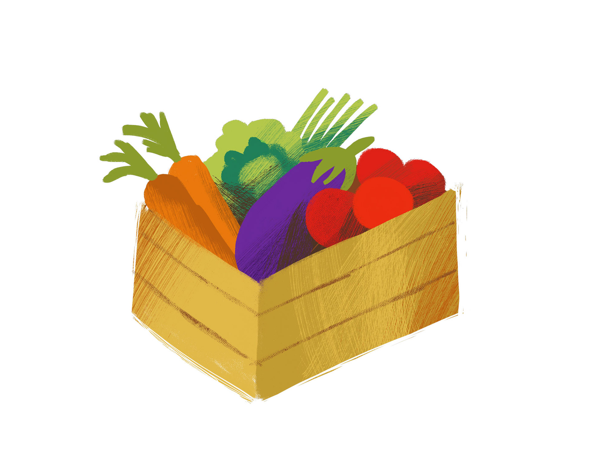
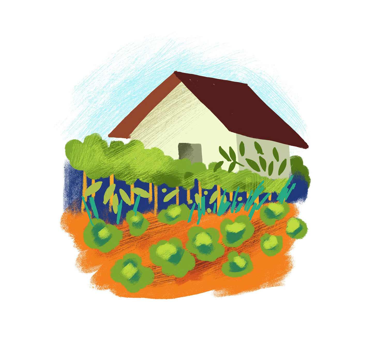
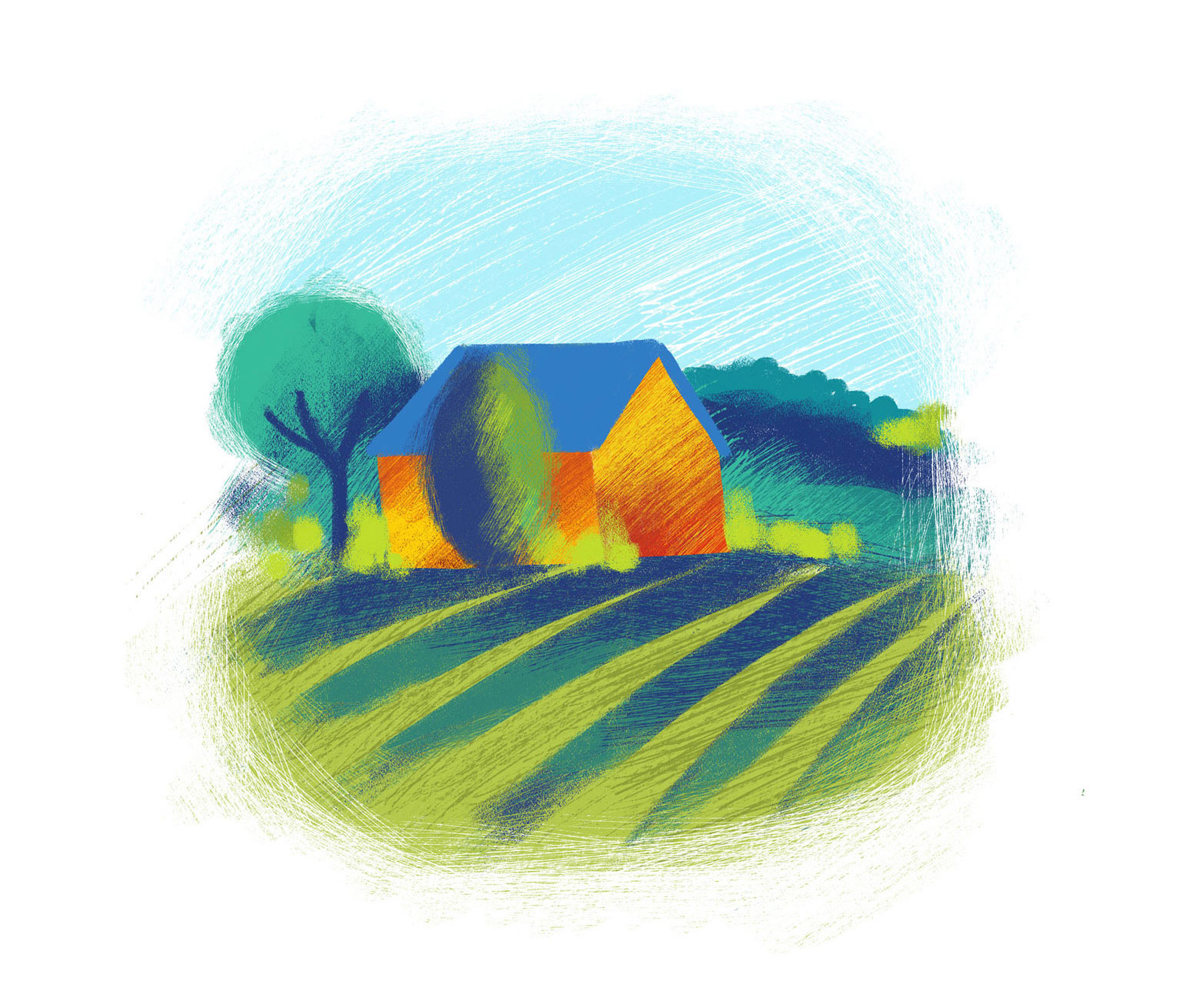
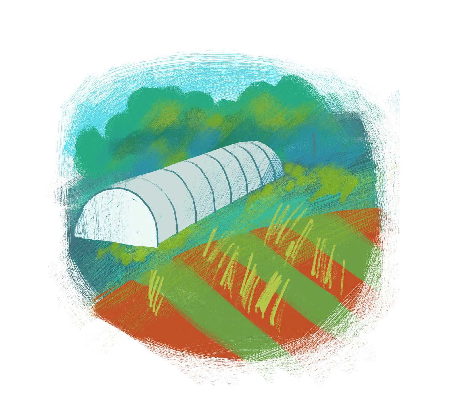
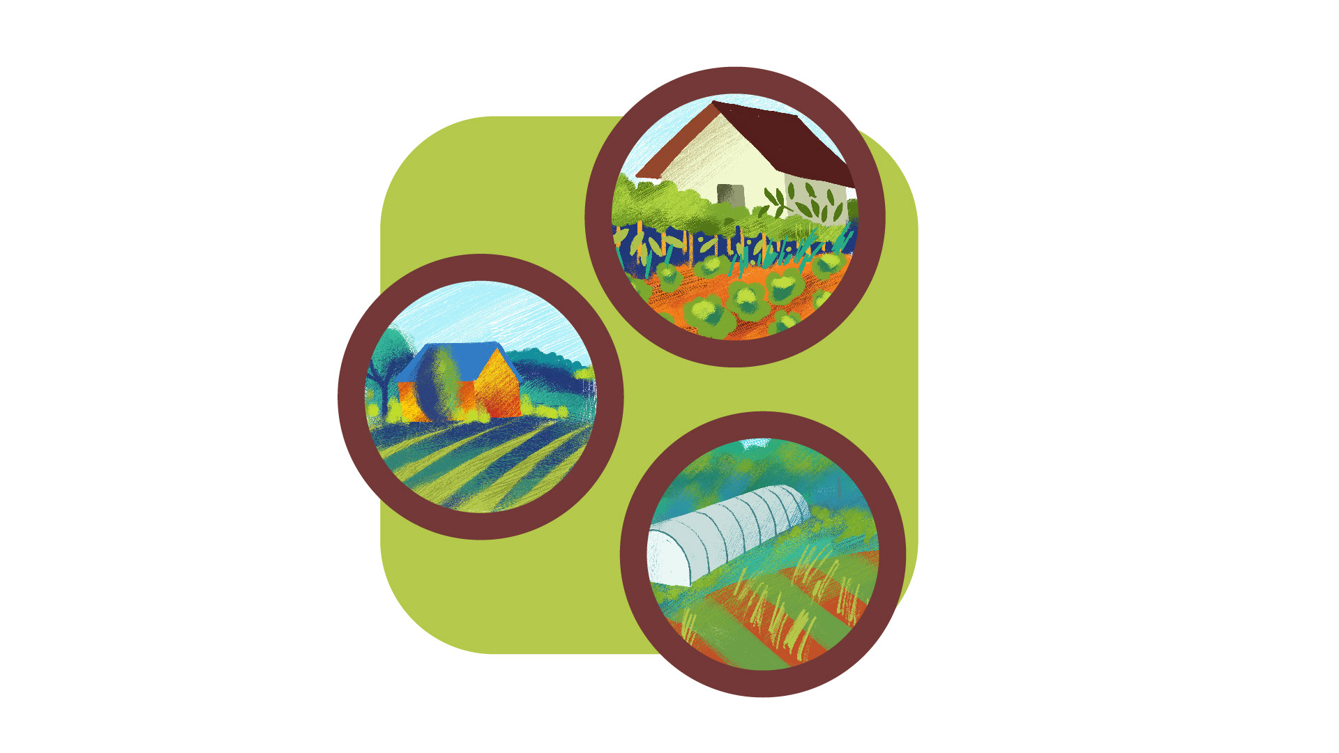
After that was approved I started drawing and creating the separate illustrations/components of the diagram. This were drawn on pencil and the final were painted on Adobe Fresco on the ipad.


With these elements I created the first composition on Adobe Illustrator, adding numbers, text and some circle lines and arrows to explain the process.
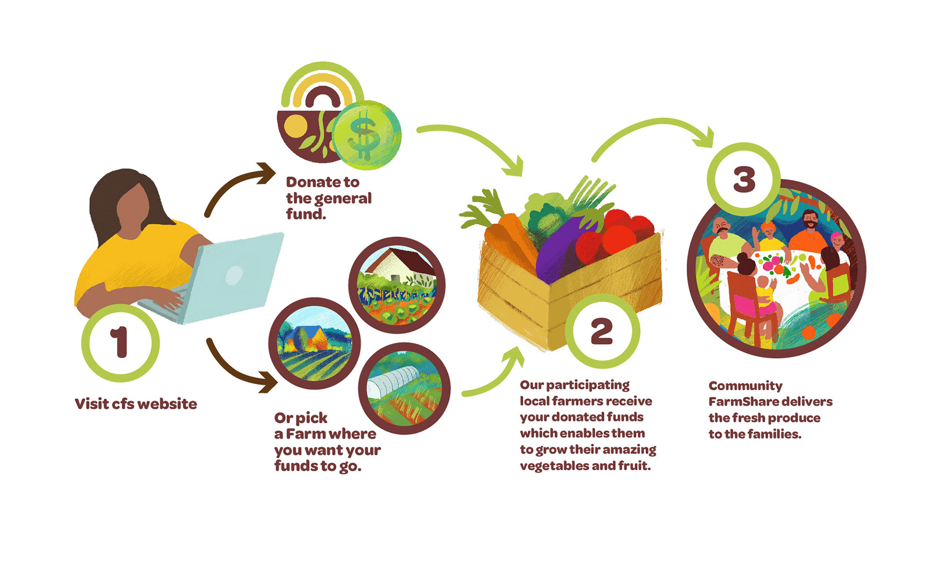
After done this, I wanted to keep exploring the illustrations adding some color backgrounds.


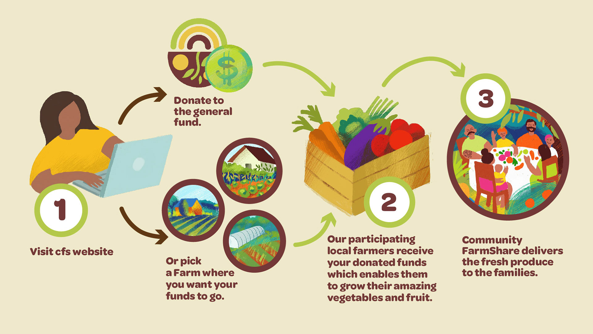
And this is the final result with those elements.
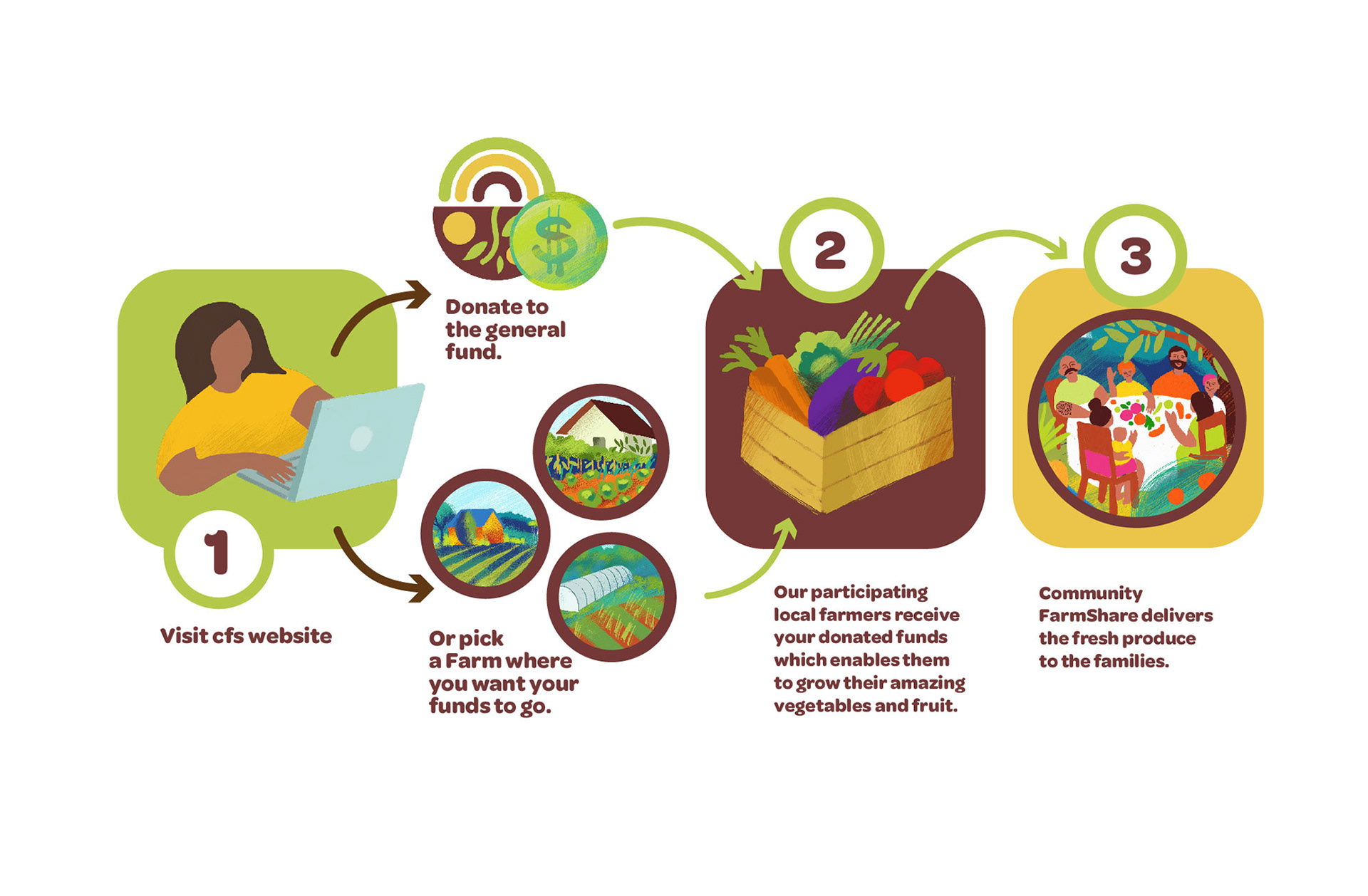
At the end I felt that the beige background we use in some parts of the website and newsletter was more appropriate and gave a warmer feel.